Who runs print ads anymore? That’s so 20th Century.
Hold on there, my friend. If that’s your attitude about print advertising, I’ve got some surprising statistics to share.
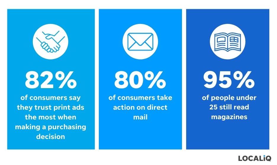
Did you know that 95% of people under 25 still read magazines?
And it gets better: The ads in those printed publications generate outstanding results. Eighty-two percent of consumers say they trust print ads the most–over all other forms of advertising–when making a decision, and 80% of consumers take action on direct mail.
Just because it’s a print ad, though, doesn’t mean it will get immediate positive results. There is an art to creating the best print ads out there. Here, we’ll explore:
- The best print ad examples
- Why they’re effective
- Tips to help you create your own masterful print ads
Here we go!
7 best print ad examples (+why they work)
Here are the best print ad examples we could find offline and why they work so well.
1. Apple: A strong headline
Our first print ad example starts with an eye-catching headline. What makes a headline stand out?
First, it should focus on your audience. You place the ad, but the story you’re telling in it isn’t about you–it’s about the prospects and customers you serve. Your headline should speak to the problem you solve for that audience and hint at your solution.
It helps if the headline is clever and catchy. As a child of the ‘90s, these classic Apple ads are seared in my memory. The brand’s iMac line was its push toward catering to the creative class, and this ad campaign speaks perfectly to the desired audience.
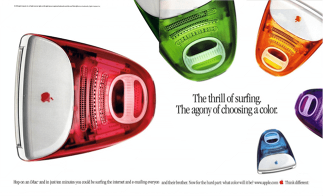
This headline gets at the excitement and promise of the internet age. Remember, this is the time of dial-up modems when at-home internet access isn’t a given. These new computers are your admission pass to the information superhighway.
Then, Apple cheekily positions the array of vibrant colors as a problem–“agony” to choose between them. In contrast, viewers feel delighted having a variety of bright machines to choose from. Apple’s candy-colored desktops stand in stark contrast to the standard beige, boxy PC.
2. Metropolitan Transit Authority: Short and sweet copy
You have limited time to capture your audience’s attention in a print ad. That’s why it pays to keep your copy short. Think of it like poetry: Omit any word that isn’t necessary.
The rules of grammar need not necessarily apply. Sentence fragments are okay if the copy is clever and clear. The one stylistic error to avoid, though, is repeating any words. With so little text, you don’t want to be monotonous. Lean on a thesaurus to help you find the proper substitutes for any duplicate words.
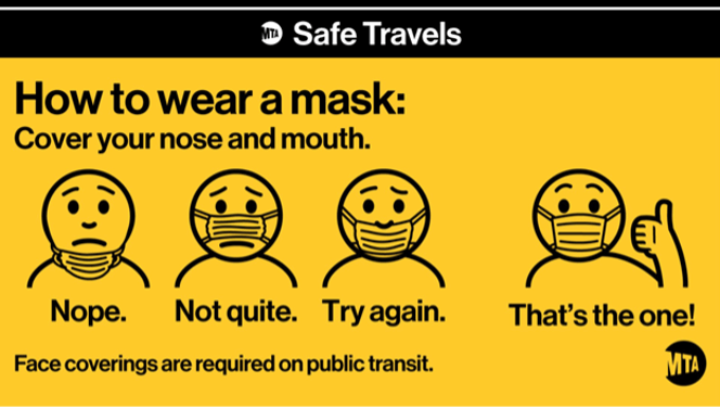
The subway ad from the Metropolitan Transit Authority is an excellent example of brief and effective body copy. The underlying message is simple: Wear your masks on public transit. The copy takes a lighthearted approach in addressing a real and pervasive issue we all saw during the pandemic–namely, that people like to get a little creative about what constitutes mask-wearing.
The visuals and body copy work in tandem to educate viewers about public health expectations while likely getting a knowing chuckle out of those who have seen the “mask over the mouth but not the nose” look in the wild.
3. Heinz: Showstopping and complementary visuals
Visuals have a vital role to play in great print ads, too. It’s not just about picking a bright or attention-grabbing image–though that’s important! The most crucial element in image design and selection is ensuring that it complements the copy.
It’s also wise to select images that fit in with the visual identity of the rest of your brand. For example, if your website consists of cartoon images and icons, it may feel out of place if you run a print ad with stock photography. Creating a style guide can help you maintain consistency across your visual assets.
It’s okay to be excited about visuals, but don’t overload the page. White space is not only okay; it’s essential. Visuals are more impactful with a little bit of breathing room.
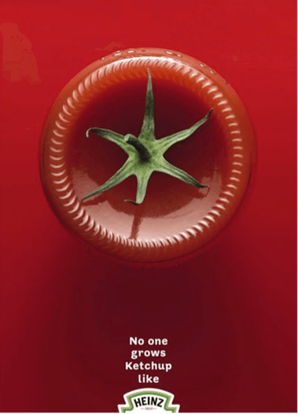
This ad from Heinz exemplifies the marriage of excellent copy and pitch-perfect visuals. The tomato stem atop the ketchup bottle implies to viewers that Heinz is made using real, fresh ingredients–and that story is supported by the headline, which uses the word “grows” instead of “makes.”
Finally, the advertising team embraced the idea of white space (or in this case, red space), giving the one photographic element lots of room on the page.
The last consideration for the visuals you create for your print ad is noting any printing limitations of the publication where you’re advertising. Will the ad be low-res on newspaper print, or will it be in a high-gloss, full-color magazine? Knowing how the publication looks on newsstands will help you find visuals with the greatest impact.
4. Toyota’s RAV4: A Cohesive Story
Unlike some digital assets, where you have free range to tell your story in a scrolling format, print ads are limited in size. You purchase specific real estate in a publication or create an advertisement for a postcard or mailer. Either way, you’re dealing with a concrete number of centimeters in which to get your point across.
With limited space comes limited attention. Your audience will likely only glance at your ad for a few seconds. Is it going to grab readers’ eyeballs and draw them in for a closer look?
This is why creating cohesion between your visuals and copy is so crucial. When words and images come together to tell the same story, your audience quickly registers your message. If your story speaks to their needs or experiences, they’ll give your ad a second glance.

This ad for Toyota’s RAV4 touts its heated seat feature. The visual shows footprints trailing from the vehicle to the snow nearby, where the two passengers have made snow angels. What’s noteworthy about these snow angels is that their seats have melted right through the deep snow, exposing the grass underneath.
It’s a cheeky way (pun intended) to show just how warm and comfortable those heated seats feel on a cold winter’s day. And the joke of the image becomes apparent to viewers when they read the accompanying copy.
5. Surfrider Foundation: A clear call to action
Once you’ve hooked your reader, ask for what you want. A call to action provides your audience with a clear next step.
If someone reads your ad and likes what you have to say, but is left wondering what to do, it’s likely they’ll flip the page and forget your message.
However, when you provide your reader with specific guidance on what to do next, they’re more likely to act on it.
The right call to action will depend on the concept of the ad and your business model. A local retailer advertising a spring sale might invite readers to come in on Saturday and Sunday for 20% off. A contractor might ask folks to call for a free quote on their upcoming home improvement project.
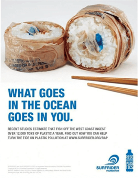
See this example from the Surfrider Foundation. The image–sushi made of plastic bags and other trash–immediately grabs your attention. Blue, which evokes the ocean, is a dominant color on the page; it’s used in the image, headline, and logo.
The headline and photo are perfectly synced and grab a viewer’s attention. You immediately understand the message that you’re ingesting waste when you eat food from the ocean. And that frightening implication encourages you to read the body copy, where you learn the damning stats about the amount of plastic in our waters.
Now that the viewer is adequately horrified, the ad wraps up with a call to action: Visit the Surfrider website to learn how you can reduce plastic pollution.
6. Canadian food bank: Relevant contact information
Along with your call to action, you must include relevant contact information.
Because of limited space in a print ad, it’s best not to include every social handle and email address. Instead, focus on the contact information a reader needs to complete the action you’ve asked them to take.
The retailer having the in-store sale should provide its store address and weekend shopping hours. The contractor offering the free phone quote should include the number where readers can reach them.
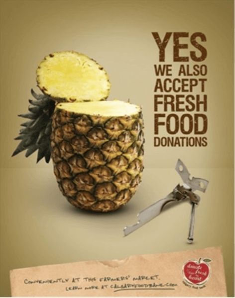
This ad for a Canadian food bank cleverly challenges the assumption that most places accepting food donations want non-perishable goods. The call to action is embedded in the headline (donate fresh food, please!), and the relevant contact information is included on the paper bag at the bottom. The food bank makes it easy for folks to donate fresh food by establishing a presence at the local farmers’ market, plus it invites readers to learn more on its website.
7. UK HSBC campaign: Digital tactics as part of the print approach
Just because print is an old-school medium doesn’t mean you can’t introduce modern-day marketing techniques into your print ad approach. In fact, the best print ads take first-party data into account when creating, placing, and tracking the ad.
Before deciding where you’d like to run your print ad, look at existing first-party data on your customers and prospects. Do they live in a particular geographic area? Are there any shared areas of interest?
Knowing this information can help you find the right audience for your print ads. You can place an ad in a trade publication that’s relevant to your audience, or you can send targeted mailers to folks in a specific geographic location.
As you’re creating your print ad, think about ways to incorporate modern tracking technology to gather even more first-party data. QR codes have gained popularity since the pandemic and are a fantastic way to gauge ad performance. Creating a QR code for a print ad helps you see how many people came to your website after scanning the code.

Take this example from a UK HSBC campaign. The ad invites folks to donate to HSBC’s Shelter program that helps people without a permanent address establish bank accounts. The QR code takes viewers to the donation page for Shelter (the QR code is now disabled).
If you’re doing direct mailers, QR codes can get even more specific. Each mailer can have its own QR code that directs to a custom URL, allowing you to serve readers with hyper-personalized messaging while you gather information about who scanned on a person-by-person basis.
All of this data gives you insights into the success of this campaign and helps you better understand your audience. Plus, it empowers you to strengthen your marketing approach in the future.
Learn from the best print ad examples
Hopefully, you can now see the power of a well-crafted print ad. The best print ads bring together design and copy to tell a story that grabs attention and invites viewers to learn more about your business.
These seven elements coalesce to create the best print ads for your business:
- A strong headline
- Short, sweet body copy
- Showstopping and complementary visuals
- A cohesive story
- A clear call to action
- Relevant contact information
- Digital marketing tactics, like QR codes
Taking the time to create a campaign that ticks all seven of these boxes is the way to find great success with this tried-and-true advertising medium.