The most effective online advertising campaigns have one major thing in common: a compelling and conversion-friendly landing page.
Without a landing page that clearly communicates what you have to offer, drives a person to take action, and is user-friendly, you’re basically throwing your advertising dollars down the drain.
But what elements make an effective landing page and what should you pay close attention to as you create your own? We’re sharing 10 of the best landing page examples across different industries and what makes them so effective.
What is a landing page?
A landing page is the first page a user visits when clicking on an ad, email link, or other campaign link. This is typically a standalone page created specifically for a marketing campaign and is built to drive users to take an action, although some businesses use their homepage or an existing page on their website as their landing page.
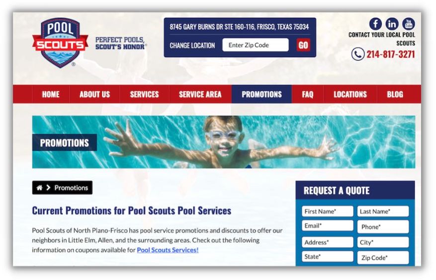
This business used a promotions page on its website for its landing page.
Your landing page is how you secure traffic on your website and direct customers to their next action. It’s an introduction to your business that aims to turn website visitors into customers.
Needless to say, it’s incredibly important when it comes to converting website visitors into leads and customers.
Elements of a great landing page
The ultimate design and structure of your landing page will depend on your company’s goals. But you’ll want to use many of these landing page best practices and key elements:
Clean layout. You’ll notice that great landing pages are pleasing to look at and have a cohesive visual identity. Great landing pages have a branding that includes cohesive background and font colors and a clear hierarchy.
Call to action. You’ll need to include a clear call to action (CTA) to encourage your audience to take the next step. If you have a long landing page, include the call to action multiple times. Your call to action can either be a button to contact you, a form, or a click-to-call number.
Add credibility. Do anything you can to add credibility to your name. Include the logos of brands you’ve worked with, awards, and testimonials. Consider using platforms like Yelp or Trustpilot that automatically embed reviews in your landing page.
This landing page example includes a callout for the business’s Google star rating.
Easy to navigate. Landing pages should be very easy to navigate. Your customers shouldn’t be confused while trying to find the information they need.
Loads quickly. A high load time will lead to a high bounce rate. When your landing page takes too long to load, your customers may choose to walk away.
Leads with important info. Put the most important information at the top. Your brand name, forms, or calls to action belong toward the top of your landing page. Less important items like reviews and testimonials can go toward the bottom of the page.
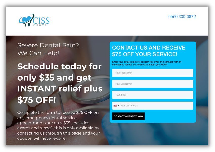
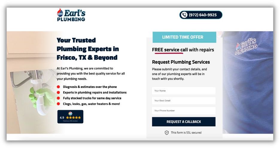
This landing page example calls out the problem potential patients might be facing, highlights the offer, and directs them to make an appointment.
A/B test. You can’t see this in action, but landing pages tend to be tested for the design, the layout, the copy, and the calls to action. Experiment with different types of copy and layouts.
Get more elements of high-converting landing pages here.
Best landing page examples
No matter what kind of products or services you offer, you can take inspiration from these amazing landing pages.
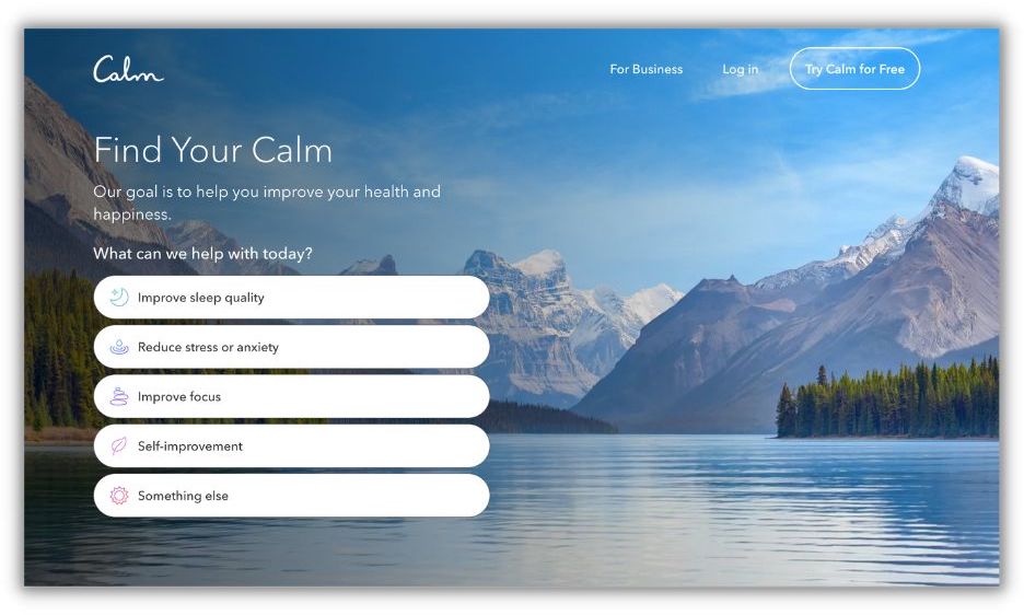
Calm
Calm’s landing page reflects the very feeling it sells: tranquility. Calm is a sleep and meditation app that aims to make everyone relax.
What makes it great:
- Background image. Calm’s background image is a soothing mountain scene above a tranquil lake. The blue in the image reflects Calm’s brand colors and is the perfect mirror to Calm’s copy.
- Interactive list. Calm makes its goals as crystal clear as the background image: it wants to improve your health and happiness. To that end, it includes an interactive list where users can click on what they need help with, such as reduced stress or improved focus, and navigate to a sign-up form.
- Targeted copy. Calm’s landing page is one of the shortest on this list. True to its brand, Calm gets to the point and creates a peaceful atmosphere immediately.
Tushy
Tushy’s audience includes anyone who poops, and they’re here to tell you why you should be washing your butt with their product. Tushy’s landing page is a great example of using humor in your copy and owning your brand voice.
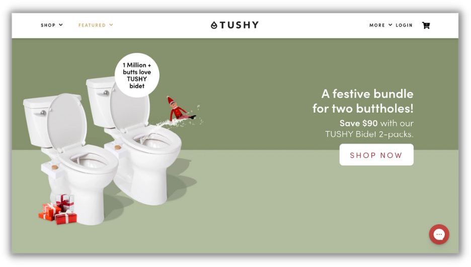
What makes it great:
- Cheeky copy. Tushy leaned into its product with cheeky copy like “a million butts love Tushy” and “a bundle for buttholes.” That copy also centers on its customers, as it highlights an active discount and customer reviews.
- Price savings. Tushy shows the amount of money customers can save depending on the number of poopers in their house. This enhances the value of buying Tushy to customers who may think Tushy is a luxury product.
- A chatbot. Tushy knows its product will raise a lot of questions, so it has a chatbot where customers can chat with a “real pooping human.” It offers a quick FAQ and an easy way to help any customers.
Squarespace
Squarespace literally sells beautiful websites, so of course, its own landing page needs to be a work of art. And it is: Squarespace has seamlessly integrated bold typography, customized copy, interactive elements, and white space to prove that its brand knows websites best.
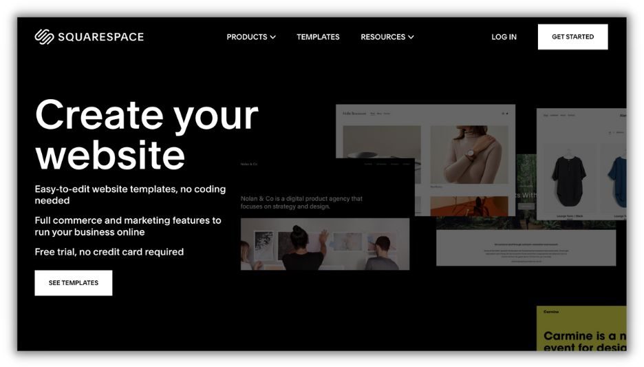
What makes it great:
- Interactive elements. This landing page includes examples of website templates scrolling through on the right side. This draws in the eye without detracting too much attention from the CTAs.
- CTA. The See Templates and Get Started CTAs are included in two prominent places on the landing page. The website’s copy immediately tells potential customers that they can start a free trial without a credit card to remove any doubts.
- Short and sweet. This Squarespace landing page is extremely short—leaving little else for visitors to do but take an action.
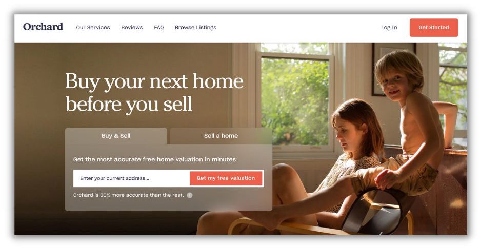
Orchard
Orchard bills itself as “a seamless way to buy and sell your new home.” Its landing page is built around offering free valuations for visitors’ homes.
What makes it great:
- Customizable. Orchard uses its landing page to target both those looking to buy and sell or just sell a home. Visitors can toggle to the option they prefer and enter their address for their valuation.
- Data-backed. Orchard includes some helpful data to drive visitors toward getting their free valuation. By making a data-backed claim (30% more accurate than the rest), Orchard is providing persuasive information to compel users to move forward.
- Added benefits. As users scroll down the landing page, they see benefits (in an interactive format) to further persuade them to take action. The benefits section concludes with another CTA to capture immediate action.
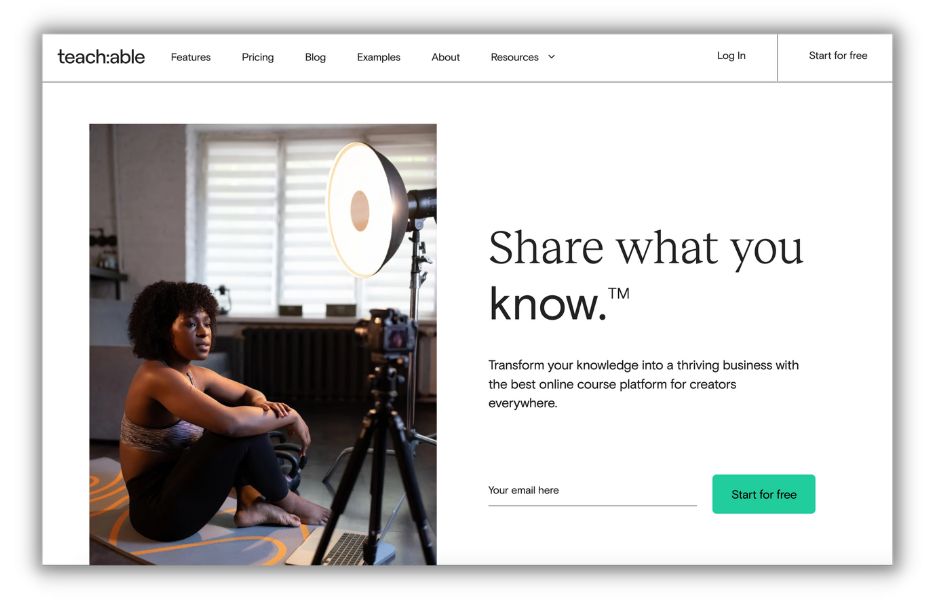
Teachable
Teachable is a platform where entrepreneurs can create and sell courses. The platform’s mission is straightforward: turn what you know into a profitable business.
What makes it great:
- CTA. Its Start for Free CTA is echoed several times throughout the landing page. Users can click a button in the menu, type their email address into a form, or see the CTA button as they scroll.
- Try for free copy. One of the biggest selling points Teachable offers is the ability to try the product for free. That messaging is prioritized on its landing page.
- Color contrast. It would have been really easy for Teachable to clutter its landing page. Instead, Teachable uses white space and branded colors to its advantage.
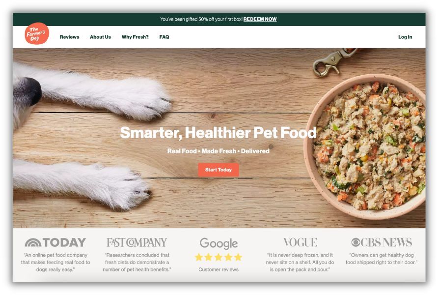
The Farmer’s Dog
The Farmer’s Dog is a great example of a landing page that centers around its customers. It is designed to show why their pet food is the one you should choose for your four-legged companion.
What makes it great:
- Credibility. The Farmer’s Dog has prioritized reviews in two places: with a reviews tab in the menu and a list of reviews from media publications below. They placed people over product.
- CTA. The orange button matches the brand colors and is front-and-center.
- Cleanliness. The landing page doesn’t include any unnecessary bells and whistles. The menu is easy to use and the page is easy to navigate.
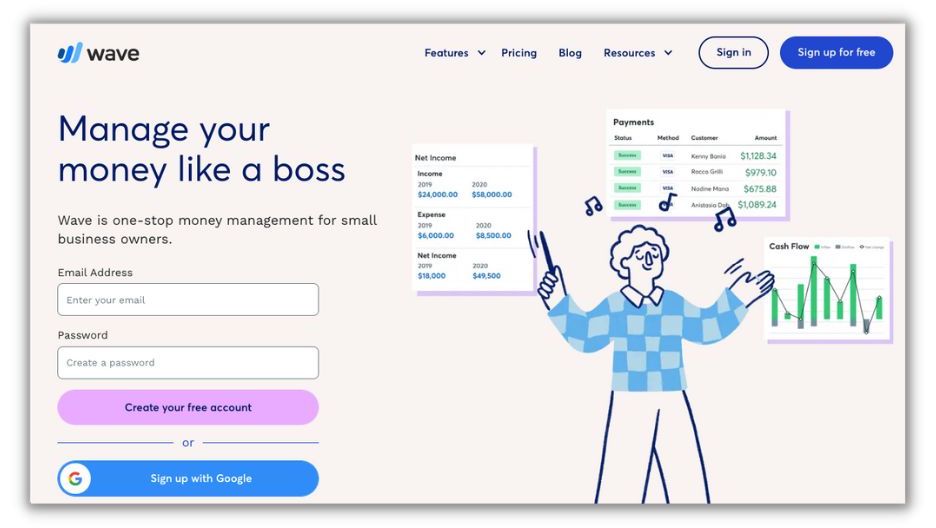
Wave
Wave’s landing page is a great example of presenting complex services to potential customers. With a clean layout, complementary colors, and great copy, Wave makes accounting software sound interesting.
What makes it great:
- FAQ section. The frequently asked question section at the bottom of the page adds valuable context without cluttering up the page. The accordion-style menu answers important questions and leads people to its customer service for more support.
- Trendy illustrations. Financial products aren’t the most exciting, so Wave punches up its look with illustrations and graphics.
- Targeted copy. Wave’s landing page walks users through each of its tools with a slideshow-style scroll. The included copy makes the difference between the free tier and paid features clear, and explains what makes Wave different.
Reel
Reel’s landing page is a great example of capturing your values and conveying them to your audience.
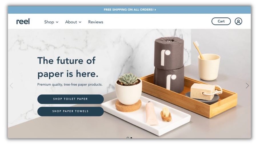
What makes it great:
- Centers values. Reel immediately speaks about what sets their product apart: sustainability. A large part of its landing page speaks to how Reel has built sustainability into its business and products.
- Reviews everywhere. The landing page features a few reviews from top publications and dedicated a section to reviews that users can toggle through.
- Quantifiable results. Reel proves its dedication to quality and sustainability with a counter of how many trees the company has saved.
Uber Eats
Uber Eats has a great example of designing a landing page around a form. The headline and call to action bring it all together.

What makes it great:
- Color contrast. The bright yellow of the hero image contrasts nicely with the bold black font. Building accessibility into your landing page is a must, and color contrast like this makes your copy more accessible to every member of your audience.
- Enticing headline. “Order food right to your door.” Simple, straightforward, and just enough to capture your attention.
- Form and CTA. By centering an easily filled-out form with a fun call to action (Find Food), Uber Eats entices people to take the next step and try its product.
Buy Me a Coffee
Buy Me a Coffee is a crowdfunding company that enables creators to accept payments and donations from their audience.
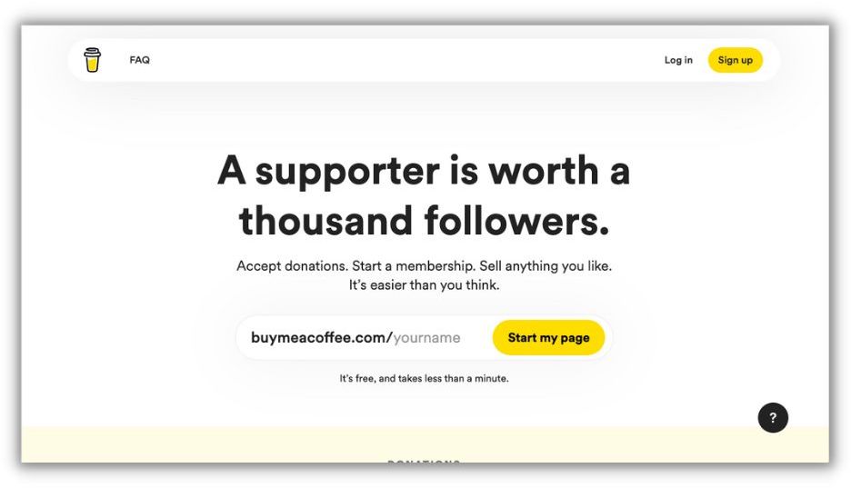
What makes it great:
- The headline. Much like the saying “a picture is worth a thousand words,” Buy Me a Coffee’s headline of “a supporter is worth a thousand followers” immediately communicates its value.
- Easy-to-scan content. Short paragraphs, lots of images, and a numbered list make this landing page easy to skim.
- Question button. Buy Me a Coffee has a simple landing page, but if users are left with questions, all they have to do is click the question mark in the corner. It will lead them right to FAQs and a help center.
Create your best landing pages
Landing pages are important for any business no matter what you sell. Create a landing page that looks nice and is easy to navigate. Include great copy and a call to action. And once you launch your landing page, don’t forget to keep it updated!
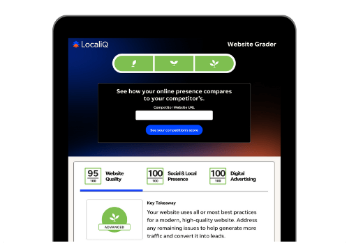
PS: Want to know how your website compares to the competition? Try our free website grader!