When it comes to websites, inefficiencies lose sales and potential customers. The better you can optimize your website, the more effective you are at directing traffic and getting results. That’s why creating a Contact Us page that addresses customer needs with clarity, functionality, and ease is essential.
We’ve compiled examples and best practices to help you craft a Contact Us page that meets visitor needs and strengthens your website.
Table of contents
What is a Contact Us page?
Think of when you first created or refreshed your website. There’s a chance that the Contact Us page was the last item in your priorities—on the back burner.
That’s not necessarily a bad thing. You have a homepage, service/product page, and other critical components for your website that serve the customer journey. But you also know the journey isn’t straightforward. Instead, it’s often an intertwining path that differs per individual.
A Contact Us page serves the need to communicate with you directly. It’s also an opportunity to provide personalized communication and connect with visitors.
A well-utilized Contact Us page can help your business convert more website visitors into customers by providing the information and resources needed to take the next step.
✏️ Is your website making the grade? Get an instant audit with our free website grader.
What should a Contact Us page include?
What are some critical components and use cases for a successful Contact Us page? Let’s explore.
Contact information
This is kind of a given, but you need to include your contact information and a way to get in touch on your Contact Us page. This should include multiple ways to contact you, including a phone number, email address, and a lead capture form.
When someone visits your Contact Us page, they’re likely close to converting or in need of a little bit more information before they convert. So you want to make it as easy as possible for them to get what they need so they can take the next step to become a customer.
Basic business information
Your Contact Us page is an ideal place to include basic information about your business beyond your contact information, including your business location (or locations if you have multiple), hours of operation, and more.
It’s also helpful to include a map if you’re a local business to help with local SEO.
⚡️ Free guide >> How to Write a Business Description that Gets Customers
A way to answer questions quickly
Businesses can use the Contact Us page to answer product or service questions or link to helpful resources.
Depending on your business type, you may include links to customer service portals, FAQs, and more to help move users down the funnel if they’re not ready to convert. This is especially helpful for ecommerce businesses that don’t need leads to contact them to convert. For non-ecommerce businesses, it’s important to remember that the less you include on the page the better so you can have a straight path toward lead conversion.
16 Contact Us page examples and best practices
Now that we know the importance of a Contact Us page, how can we improve it on our website? Below are examples and takeaways to help strengthen your Contact Us page experience.
1. Stanley
Nothing is more frustrating than wanting to contact a business and spending five minutes trying to find the right page. Your website should be straightforward, and someone should be able to find your contact form in a few seconds.
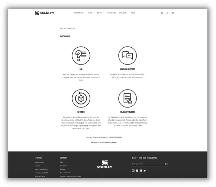
For example, you can find the page link in the footer on Stanley’s website. While this page lacks a form, the Contact Us is easy to find and offers many options. The company directs inquiries by needs like general help or warranty claims. There is a FAQ section for quick answers, a direct phone number, and a schedule for operational hours.
Businesses make Contact Us pages accessible by including the link in the menu or the website’s footer section. It’s a great idea to do both: include your page on the menu, while the footer section contains quick information like an address, phone number, and email. Businesses can also create a directory to help guide visitors and customers to the right place for unique questions.
Takeaways
- Ensure that your Contact Us page can be found within a few seconds of a home page visit. There are a few popular spots like the top menu, the footer, or the final section of a responsive website design.
- FAQ sections on your Contact Us page are helpful because they can solve a customer issue immediately and save your team time answering the same questions.
2. On Running
Contact pages should be very minimalistic and pleasing to the eyes. It’s a functional page, so ensure it’s straightforward and people can quickly put in information and hit send.
Your page should have a small introduction section and a form box.
Takeaways
- When in doubt, always shoot for simple and clear designs.
- Contact Us pages should be straightforward; don’t make the options too fancy.
3. ReMarkable
ReMarkable, the digital notebook tablet, does a great job directing customers where they should go. When they hit the contact button, they immediately get directions depending on their needs.
Customers can start with self-service immediately if they need technical help or request a refund. The website has an expansive portfolio of resources to offer immediate help. If you need more assistance, click the email button on the primary page.
This is another excellent option that equips customers to service their own questions and needs while offering an immediate contact option.

Takeaways
- Create a robust resource portfolio for the customer to solve their needs.
- Offer an immediate contact email for customers who cannot invest time into resources or need help.
🔎 Want searchers to see (and click on!) your site? Download our free guide >> Ways to Make Your Website More Visible on Google
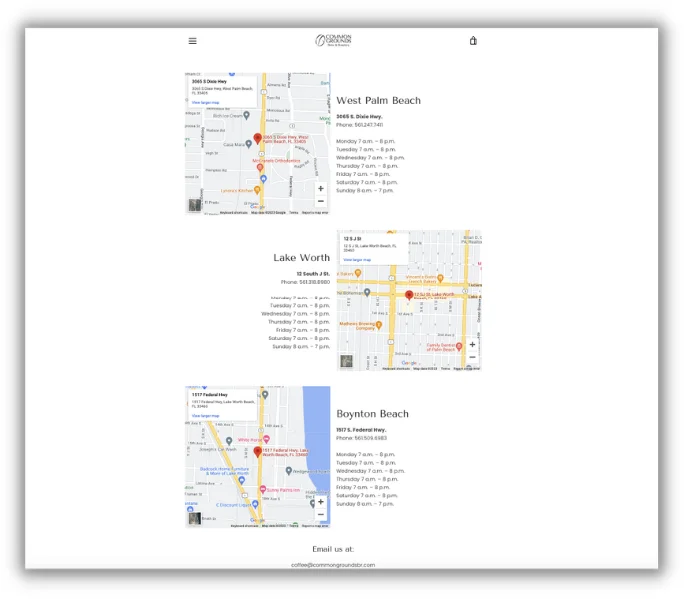
4. Common Grounds Brew and Roastery
Every visitor is unique, and many will have different preferences for contacting you. If possible, add a few ways for people to reach you.
You can start with the form, but you can also add a mailing address, a physical location, a phone number, or an email address. Many companies have chat features and other ways to interact with them.
In the case of Common Grounds, visitors have several ways to contact the coffee shop. This page shows all three coffee shop locations’ operational hours and phone numbers. There are interactive maps per location. At the bottom of the page, there is an email address.
Add only essential boxes to the form. A contact form is central to the Contact Us page but shouldn’t be complicated. The longer the form, the less likely people will fill it out.
Takeaways
- Location is a top question for customers and local businesses, so make it front and center.
- Add maps, days, and hours of operations.
- Local customers often want local relationships, so adding personal communication methods like a phone number adds to the experience.
5. Just Right Lawns
Just Right Lawns’s Contact Us page does a great job of driving the user toward conversion.
The page provides multiple ways for customers to contact the business–including a click-to-call number, a form, and a chat feature. The Contact Us page also includes a link to a special offers page to further entice users to become a customer. Plus, below the form, Just Right Lawns includes some helpful social proof in the form of customer reviews that might urge the user to reach out and schedule a free consultation.

Takeaways
- Providing an incentive in the form of special offers, a free consultation, or a free demo can help drive more lead conversions on your Contact Us page.
- Consider including customer testimonials or reviews on your Contact Us page, especially for service-based businesses, so potential customers feel more comfortable contacting you.
6. Six Flags
Visitors want a quick response, but they are generally reasonable if your business is straightforward on when to expect an answer.
Give visitors an idea of when you’ll respond. After submission, add a message to let them know how long it will take. The sooner, the better, but mentioning 24-48 hours is acceptable.
You can create a more efficient process by categorizing your contact form with a drop-down menu. It allows visitors to pick the subject. You can segment those questions by urgency if specific issues need a faster response.
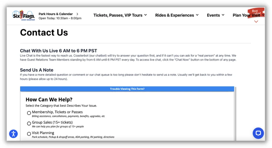
Six Flags states that responses usually take a few hours but up to 24.
Takeaways
- Include a time range of when you respond so customers can gauge their expectations.
- Make response times as quick as possible but at most 48 hours.
- If response time is an issue, categorize questions so you can prioritize urgent requests.
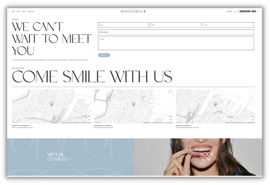
7. Boston Dental
For healthcare businesses like dentists, a Contact Us page is where most new patients will look to make an appointment or reach out for additional information.
Boston Dental’s simple Contact Us page includes a contact form at the top of the page, information about their locations (including maps and links to location-specific pages that include location address, phone number, and hours of operations), and separate links to book directly or schedule a virtual consultation.
This gives users a clear path to find the information they need and contact the dentist based on their needs.
Takeaways
- Create a separate form for people’s different needs to contact you. This can help you follow up accordingly based on someone reaching out with a question vs. wanting to book an appointment or make a purchase.
- If you have multiple locations, create location pages with your contact information for each. This can help the customer have a better experience by ensuring they’re contacting the right location and can also help with local SEO.
8. Clio Websites
Local agencies focused on digital products, design, and online services can learn from this minimalistic contact form. It has an easily recognizable page with clear utility (the form is readily available to the right).
What makes this page unique is the welcoming invitation to customers and website visitors. Clio doesn’t just want queries. It wants to help educate visitors and start a conversation. The copy encourages people to reach out about design as a topic. The paragraph continues by reemphasizing their invitation with “We are never too busy to answer your questions…”.

This is one example of a simple design.
Takeaways
- Invite visitors to start conversations. Contact pages don’t have to be only about sales or concerns. They can be about nurturing prospects and customers.
- Contact pages don’t have to be fancy. A form can go a long way.
9. Kroger
Kroger offers a Contact Us page with multiple solutions. When visitors click on the page, they arrive at a menu. You can chat with their team, email them, or call. The page also includes operation hours.
At the bottom of the page, customers and visitors see a directory of phone numbers based on departments. This is a great way to direct visitors for direct personal phone calls to the right team member.

Takeaways
- One phone number is helpful, but a direct phone number is better. Include a directory of phone numbers based on departments or professionals so visitors can get the right help faster.
- Prioritize what you want visitors to do by making it first. In Kroger’s case, it emphasizes the chat feature first. It’s best to pick the option that can offer value the quickest.
10. Red Rhino
If you’re a service-based local business, phone calls might be your primary communication. So why not streamline it? The pool leak company, Red Rhino, offers quick communication with their phone call center.
If you call, you get a person on the line immediately. Whether it’s for a quote, sales question, or customer service, you click on one of their contact buttons and connect with their team. Red Rhino’s contact option is all over the website, but at the top corner, there is a clear phone icon and number to call. You can find the correct number by picking the location on the dropdown next to the phone icon.
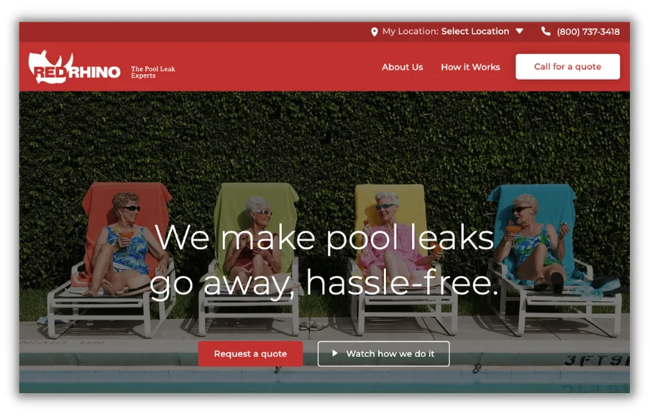
Sometimes, you have to lean into your strengths, and if you have a solid phone communication strategy, you can offer real human help without the fancy tools.
Takeaways
- Person-to-person communication is a unique advantage. Incorporate it into your website if you can do it and respond quickly.
- Add an easy dropdown for visitors to pick the right phone number based on location.
11. Thriftbooks
You can add a FAQ section at the bottom of the page. Often, questions are more common than we think. By including some of them on the page, you can help someone immediately and minimize repeated questions on the form. Add answers to common questions. Unlike the resource center link, this section can be a drop-down widget under the form.
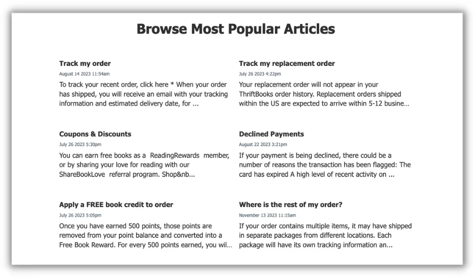
Thriftbooks creatively turned its FAQ section into full articles so that someone can get an answer to common questions that are fully fleshed out.
Takeaways
- Add a FAQ section that answers each question and lets customers click on more in-depth articles.
- Curate FAQ questions by most commonly asked or higher priority questions.
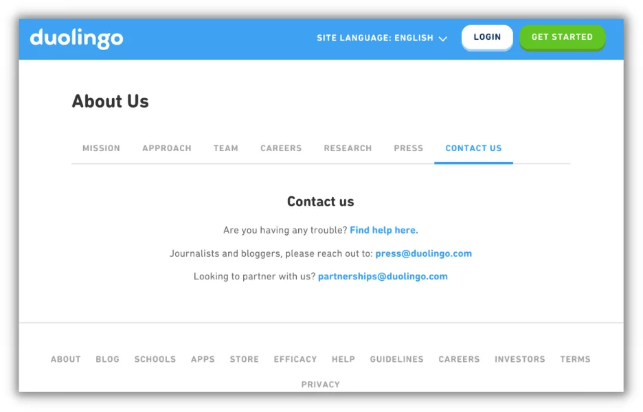
12. Duolingo
Duolingo has a simple Contact Us page: a reminder that you don’t need bells and whistles to get the job done. They start you off with a simple directory focused on who you are and what you need. When you click on the “help” option, it takes you to a FAQ section. Duolingo categorizes the FAQs by subjects like privacy, technical issues, and account questions. The resource page is also searchable.
Duolingo includes a form at the bottom. But it differs from most platforms. Instead of a general form, the button labels it as a “bug report.” This ensures questions are more focused on the app’s functionality. While it might not be the best option for all customer inquiries, it’s a great example of directing traffic for a specific type of question.
Takeaways
- If you want to create a simple Contact Us page, you can do it in just a few lines.
- Create a simple directory based on who the person is (a customer, partner, or prospect).
- Label your buttons or forms to specific topics to encourage an issue-related question.
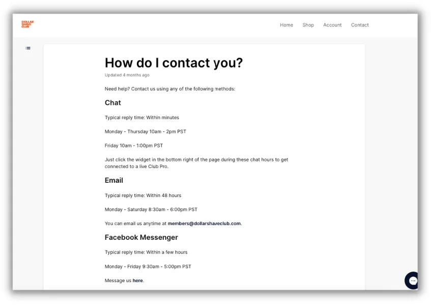
13. Dollar Shave Club
Dollar Shave Club does its Contact page a little differently. It’s a helpful resource page—almost managed like a blog article. The team updates it regularly so that the information is current and relevant. It includes a chat with response expectations, which is fantastic because so many companies have chat boxes with customers waiting forever for a response. Visitors can email the team, too.
But what makes this page unique is that they also highlight Facebook Messenger. This is an excellent example of offering more options based on visitor preferences. The brand likely knows where its customers like to hang out, and they provide service right where they are.
Takeaways
- Meet customers where they are by including alternative channels for communication, like direct messages on social media.
- Response expectations should be added to chat boxes, especially since most visitors assume faster replies.
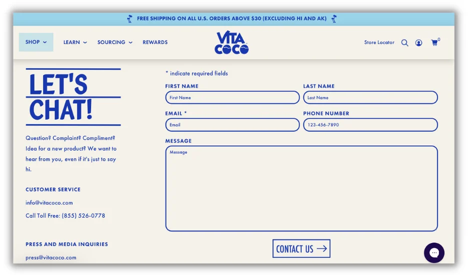
14. Vita Coco
Like Clio Websites, Vita Coco wants visitors and customers to start a conversation. They even encourage visitors to submit new ideas, sparking possible customer-generated innovations.
The page is also straightforward and seamless.
Takeaways
- Shape the conversation when you invite visitors to send in their input, especially ideas, to improve your product.
- Ask for multiple ways to contact the person, such as an email and phone number. Make only one required. When you have multiple contact points, you can better reach the customer.
15. Shake Shack
Shake Shack has a great directory on its contact page. Visitors can pick their subject and press continue. It leads them to a form that guides them through issues or questions with drop-down windows and interactive questions.
When the visitor finishes their form, team members have an in-depth idea and context of what’s going on.
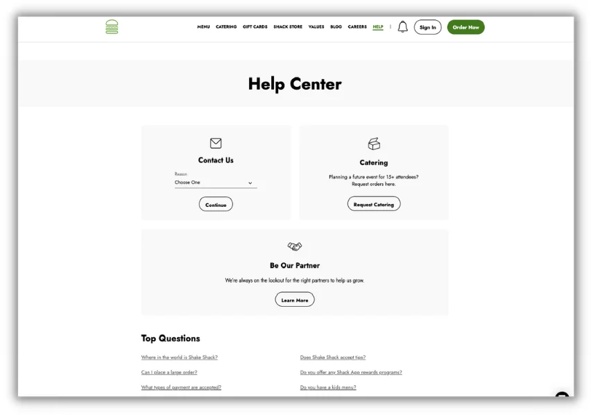
The form also has a FAQ section and smartly names it “Top Questions” to encourage visitors to review, and possibly, before sending questions (it’s much better communicated than “FAQ”).
Takeaways
- Walk customers through the journey by categorizing questions and creating interactive steps within each form to get better submissions.
- When adding a FAQ section, use more easily identifiable language like “Top Questions.”
16. Scribd
Scribd, now divided as Scribd for documents and Everand for books, has a contact page that helps guide visitors to the right place. You can pick a help option, business opportunity, inquire if you are a publisher, and more options. When visitors click help, it leads to an AI chatbot for 24/7 help.
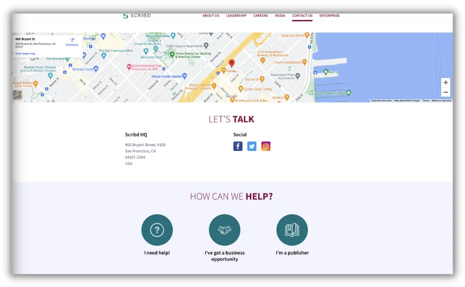
Scribd also adds a map and address right on the top of the page. That’s unique coming from a tech company, especially if they don’t have traditional contact methods like phone calls. But it adds a nice personal touch to their brand (unlike mysterious large corporations that may seem complicated to get ahold of).
Takeaways
- AI chat assistants are great for immediate help.
- Add a map even if you aren’t a local-focused company to add a more human component to a remote or digital company.
Getting started: Contact Us pages
This guide should help you improve your Contact Us page. As you interact with your audience, you can continue strengthening the page and implementing the best practices mentioned in this article.