When it comes to your small business website, it may seem like simply having one is enough. I mean, nearly 30% of small businesses don’t have one at all, so it’s a good place to start.
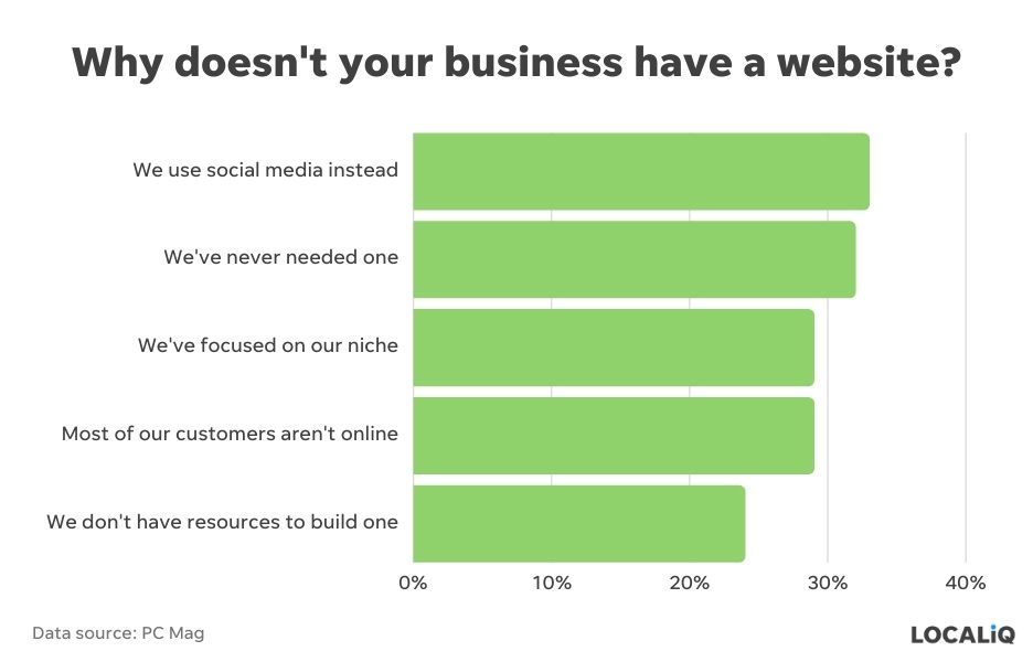
But, unfortunately, in today’s world, it’s not enough. There are nuances when it comes to your small business website design that can make or break the success of your marketing—and your business.
“Great web design is more than just how it looks,” said Ben Miller, founder of web design and digital marketing firm Focus On Digital. “Sure, it’s important to have a great-looking website, but there’s so much more to it than just that.”
“A great website combines layout, design, and function in a way that delivers a cohesive, smooth, user-friendly experience for the viewer.”
In this post, we’ll outline the 15 small business website design best practices (with examples) to help you stand out and win online.
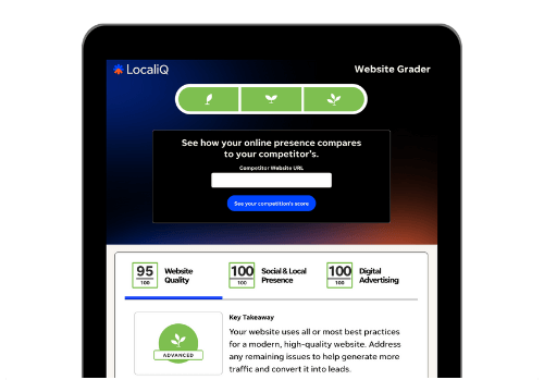
Want to know how your website stacks up right now? Try our free website grader to get your score now!
15 small business website design tips (with examples)
Incorporate these small business website design best practices from the experts to create a site that works for you.
1. Choose the right domain name
First, you’ll need to secure the right domain name—and you’ll want something that is both simple and professional, said Andreas Johansson, a UX specialist at his agency, Andreas Johansson UX.
“Ideally, it should be easy to remember and spell, and it should also be relevant to your industry,” he added.
When choosing your URL, include pertinent information without getting too detailed and therefore too complicated.

“You want it to be simple and easy to remember for your clients and easily searchable for potential clients who might find you on the internet,” added Nick Antonopoulos, founder of digital marketing agency SEO Design Chicago. “As you can see, our address, seodesignchicago.com, says exactly who we are and our company name.”
2. Identify the best web hosting platform and CMS
You’ll also want to select a web hosting platform and content management system (CMS).
Isla Sibanda, a cybersecurity specialist at VPN review site Privacy Australia, recommends opting for a platform with good tech support.
“As a small business, you have a limited sum of money that you can invest,” she said. “So when building your website, make a smart, informed investment in a website hosting service.”
Antonopoulos agreed, noting platforms like GoDaddy, DreamHost, and InMotion offer a range of server options and security and come at varying price points. So it’s up to you to choose the right fit for your business.
In addition, Sibanda said to invest in a quality CMS, which “will not require you to have an immense amount of technical knowledge.”
The myriad options include WordPress, Drupal, Magento, Joomla, Wix, Squarespace, Shopify, and WooCommerce. Once again, the right fit will depend on factors like user-friendliness, extensibility, and budget, she said.

An example of what you’d see if you used WordPress as your CMS.
Another option is to build a custom CMS. That’s according to Marc Stitt, CMO of operations management firm FMX, who said a custom CMS allows site owners to easily update their sites.
“It’s difficult for a small business owner to understand and use popular content management systems because of their one-size-fits-all approach,” he argued. “As an alternative, you might choose a CMS that is tailored to your company’s specific needs.”
(You can also always outsource your small business website to take care of all the details for you!)
3. Choose the right website layout
Once you have these basics down, you’ll have to tackle the site layout.
No matter how you decide to do this, remember to keep things simple and to use a clear information hierarchy to organize site content.
“When we think of web design, it’s easy to start thinking of images, videos, fonts, and the like,” said Adam Ng, the CEO of product review site Trusted Malaysia. “But, the granddaddy of them all is the information hierarchy…it’s the principal means by which users will engage your content.”
For Alex Lefkowitz, founder of video editing site Tasty Edits, that means tapping into one-page design. I.e., “all important pieces of information should be easily accessible on the first page by simply scrolling down,” he said.

Tech giant Apple is a great source of inspiration for this approach.
4. Focus on the design structure
In a similar vein, experts recommend small businesses opt for a clean, simple site design.
“Cluttering your website with anything that complicates the general user experience doesn’t make your website better,” said Sally Stevens, co-founder of search site FastPeopleSearch.io. “When building a website, your first concern should always be the end-user and how the website feels. Anything that may end up becoming dead weight needs not be added onto the website.”
Indeed, David Stellini, co-founder of design firm All Front, said small businesses should focus on “human-centric design” to build an effective site.
“Your user’s cognitive burden should be considered while designing your product,” added Chris Song, senior vice president for business development at energy transmission company ADC Energy. “For example, a flurry of colors, graphics, and content will only confuse your audience.”
Instead, create a style guide for basic elements like typography and color palette. Then, Stellini said, it’s as easy as following your style guide throughout. Also, be sure to incorporate white space to make the site easier to skim.

Stellini pointed to his own site as a good example as it immediately presents the key offering and then asks visitors to choose a category to cater content accordingly from that point on.
5. Keep your site pages consistent
Another goal in web design should be consistency. In other words, don’t use different design elements on different pages.
“The overall layout and design of all pages should be the same,” said Kathryn Smithson, CMO of social media agency PathSocial. “In 2022, this is one of the most prevalent reasons for businesses to consider a site redesign.”
Khunshan Ahmad, crypto expert at stock review site The Stock Dork, agreed, noting consistency extends beyond elements like color and style to writing tone.
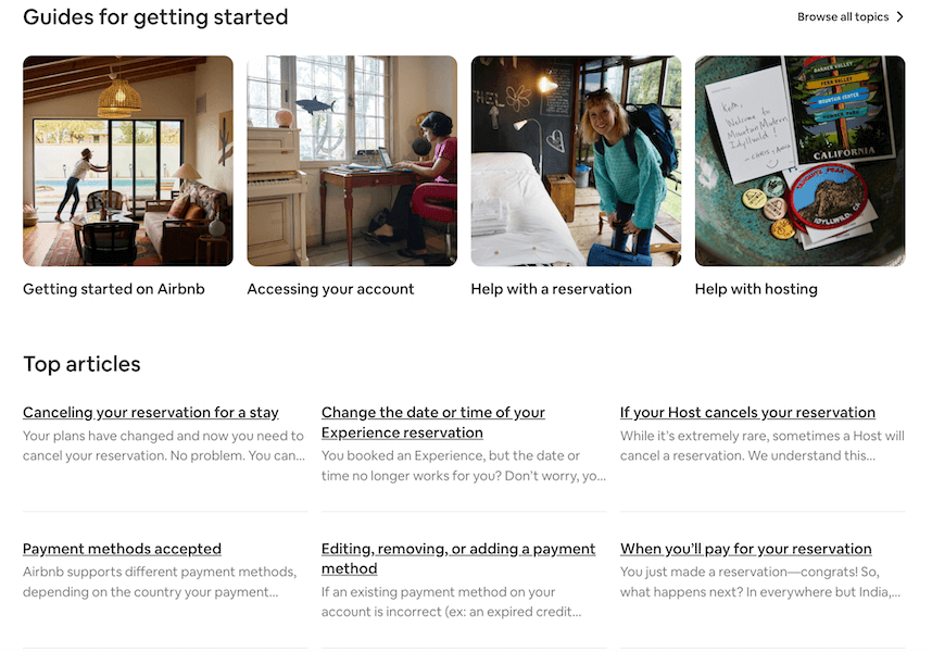
“Airbnb is a great example of a site that uses consistency in its layout,” he said. “Each of its Help pages has the same layout, making it easier for visitors to navigate through without any confusion.”
6. Prioritize the user experience
On a related note, user navigation is arguably one of the biggest considerations when developing a website.
Petko Georgiev, founder of software development firm Milenix Software, recommends simply following common usability patterns.
“People already have certain expectations about how different page elements are organized and work,” he said. “They expect links to look like clickable links, your navigation to be located at the top of your page, and the home page button to be on the left side of the top menu. Read ‘Don’t Make Me Think’ by Steve Krug and save yourself some trouble.”
In other words, integrate clear navigation menus so users can easily figure out where they want to go, said Morshed Alam, editor at programming guide Savvy Programmer.
“One of the things that hook visitors and make them continuously scroll is the ease of navigation that a website can provide,” added Rithy Thul, the co-founder of blockchain platform Selendra.org. “A good website design should not just focus on its appearance, but also on the practicality and cleverness of putting these icons in places that are most visible and accessible for visitors.”
Aseem Kishore, founder of tech tip site Help Desk Geek, agreed, noting, “If anything matters in a small business website, it is the ease of navigation and user-friendliness. No matter how tech-abled a person is, they will get frustrated with a complicated website design.”
Christiaan Huynen, CEO of design agency DesignBro, said Spotify is a good example of a site with effective organization.

“Their elite use of text arrangement and size diverts your attention to the company’s mission before anything else,” he added.
On the small business side of things, Rahul Gulati, founder of web design firm GyanDevign Tech Services, praised Facebook agency Lead Guru as a positive example with its “clear-defined headings [that] articulate Lead Guru content is focused on users’ problems and the results they have achieved.”
Related: Accessibility is a key part of the user experience. Use our website accessibility checklist to make sure your site passes the test.
7. Create specific product or services pages
And, of course, if you have products and services to sell, you’ll want specific pages for them as well.
In fact, Roberto Torres of online marketing firm The Local Marketer, recommends a dedicated detail page for each one.
“Each of those product or service pages can be internally linked to from a summary service and product page, giving ample internal linking opportunities and giving structure to the site,” he said. “The URL structure can reflect the navigation where /services is the summary page and /services/service-A is the detailed product or service page.”
For Torres, JR’s Landscaping is a good example.

“They have a service page that summarizes each of their services, then each service has a dedicated page that goes into more detail and showcases a photo gallery,” he said.
8. Don’t forget the About Us page
As you think about what elements to include, be sure an About Us page is also on the list.
That’s according to Adam Fard, head of design at his own eponymous agency, who said many small businesses don’t emphasize this page enough and miss an opportunity to build a bond with potential clients. Include details like what the brand does, as well as the brand story to help cement that bond—and don’t use generic stock photos here.
He pointed to Coelihack, an Australian company that sells gluten-free products, as an example. In addition to information about the company itself, they share details about the directors, their purpose, and even sustainability.

Ryan Webb, founder of software guide AppIntent, agreed brands that don’t make it clear to site visitors precisely what they do risk losing them.
“Sure, it might seem boring to have a homepage headline that states ‘We Sell The Best-Tasting Coffee In New York,’ however, this is far more effective than opening your website with a slow animation or video stating, ‘We believe in fair trade, how every farm provides a unique flavored bean, how each farmer deserves to earn a fair living,’” he said.
A big brand like chocolate bar giant Tony Chocolonely can get away with it, but smaller brands need to get to the point faster, Webb said.
9. Add search functionality
To make site navigation easier, consider including a search box.
That’s according to Sharon Winton, director of marketing at shopping guide GoMontana, who recommended it should be in a “prominent location where people can notice it right away,” which is precisely what the Go Montana site has done. That, in turn, enhances the customer experience.

“Customers nowadays want quick results and don’t have the patience to browse a website and be inundated with information they don’t really want,” she said. “Everything becomes easy for them and better for your website if there is a search box.”
10. Craft the perfect call to action
You’ll also want to nudge site visitors to take some kind of action—such as visiting another page for more information or sharing their email—with a call to action (CTA).
Georgiev notes a CTA can help advance potential customers down the sales funnel.
But Faizan Fahim, junior marketer at tech company Spacelift, cautions the language in a CTA should be clear so visitors understand precisely where they are going after they click on it. In other words, avoid vague text like, “Get Started,” or, “Sign Up Now,” and instead emulate brands like software platform Trafft, which encourages visitors to “Try Now for Free,” or web hosting platform Hostinger and cloud hosting platform Serverguy, who invite visitors to chat and talk, respectively, and make the next steps crystal clear.
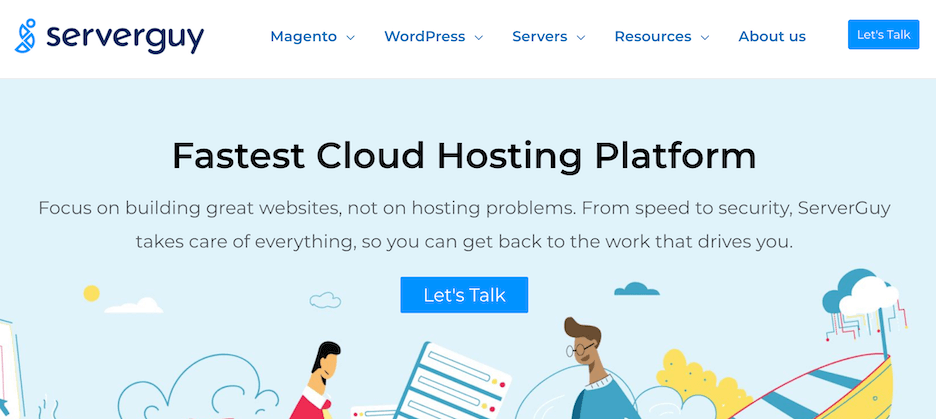
“The easier it is to take the next step, the more people are willing to follow,” said Jonathan Tian, co-founder of Whatsapp management tool Mobitrix. “It creates an excellent user experience by guiding them instead of letting them wonder what to do next.”
11. Balance the right visual elements
Another design element to consider is the overall balance of visual elements.
“Accessibility, business objectives, and aesthetics must all balance each other out in order for a website to have the desired maximum effect,” Huynen said. “Simple and straightforward features are best incorporated to ensure accessibility that drives towards the business’s short-term and long-term goals. Tons of designs can meet this balance, but make sure that everything coordinates for better lead generation and customer satisfaction.”
An easy way to achieve this balance is by ensuring all visuals have a purpose.
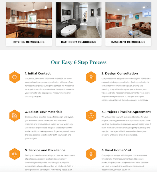
This website features a good balance of images and icons to break up the homepage.
“It’s tempting to go overzealous when it comes to including pictures and videos on websites. After all, graphics and videos generate far more interaction than text alone does,” said Jeff Mains, CEO of software firm Champion Leadership Group. “You should, however, avoid overcrowding your sites with graphics that aren’t necessary. Make an effort to strike a balance between text and attractive visuals that serve a purpose rather than encompass an image for the sake of including one.”
12. Include your contact details
And, of course, be sure to include contact details so customers and prospects can easily get in touch.
“Surprisingly, many small business websites don’t provide clear contact details to their visitors,” said Mark Daoust, CEO of Quiet Light, which helps entrepreneurs buy and sell internet businesses. “You should at least clearly show your email address and social media accounts on your website. This information allows your customers to reach out to you quickly and helps them identify you as a legitimate business.”
Jon Bennion, CEO of digital marketing agency Online Marketing Gurus, noted including social media buttons also provides social proof, which can influence visitors’ purchase decisions.
“Your website design should highlight elements that present social proof, such as customer testimonials, reviews, client videos, awards, and links to online media where your brand was featured,” he added.

Cleaning brand Good Vibes is a good example to follow here.
13. Comply with privacy laws
In addition, you should think about how the site will notify users about cookies—at least until Google stops supporting them.
“Most designers plan for this as an afterthought, making it annoying and distracting to the user,” Webb said.
14. Use responsive design
One of the top tips under this umbrella is to make sure your site is responsive and therefore mobile-friendly. That makes it easy for visitors to come to your site on a range of devices—and ultimately increases conversions.
Responsiveness helps sites adapt to the device in question. Per figures from Howard Birnbaum, founder of electric fireplace brand Magik Flame, 93% of consumers leave if a website isn’t optimized for their device.

According to Birnbaum, file-sharing site Dropbox is a great example of a site that has built a customized experience for each device, yielding a seamless customer experience.
“Dropbox has done an incredible job in creating a fluid grid and aesthetically appealing visuals,” he said. “Its font color changes as per the background of your device and image orientation also alters, hence maximizing user experience.”
15. Optimize site speed
Another important consideration is site speed.
That’s because consumers have very little patience for slow sites, but also because Google uses site speed as a ranking factor, Georgiev said.
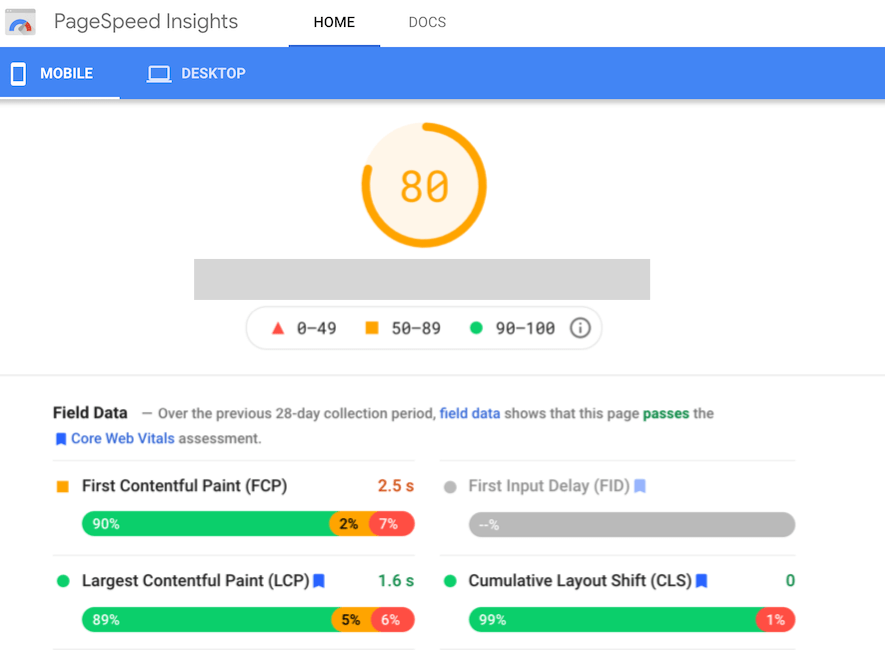
To make your site faster, you should start by shrinking images—and minimizing features like hovers and animations.
“Avoid using Flash animation unless absolutely necessary,” Alam said. “Use CSS animations instead whenever possible.”
Site speed should also be a consideration when evaluating web hosting platforms.
“By choosing reputable hosts, you may reduce the time it takes for your site to load,” said Vaibhav Kakkar, CEO of digital marketing firm Digital Web Solutions. “Typically, the lowest monthly hosting service does not provide the best value. It may be inexpensive, but it is also likely inefficient and unreliable.”
Ecommerce giant Amazon, for example, takes just about a second to load and is arguably the gold standard.
Small business website design made easy
Your small business website serves as the online hub of your business and can be a valuable tool in helping capture and convert leads into customers. With the right small business website design, you can increase your chances of getting found—and getting new customers.
Here are the top small business website design best practices:
- Choose the right domain name
- Identify the best web hosting platform and CMS
- Pick the right website layout
- Focus on the design structure
- Keep your site pages consistent
- Prioritize the user experience
- Create specific product or services pages
- Don’t forget the About Us page
- Add search functionality
- Craft the perfect call to action
- Balance the right visual elements
- Include your contact details
- Comply with privacy laws
- Use responsive design
- Optimize site speed
Related Articles
-

8 Best Social Proof Examples to Inspire Your Business
-

5 Low-Cost Google Marketing Strategies to Grow Your Business
-

18 Ways to Increase Your Online Presence (+3 Extraordinary Examples)
-

5 Customer Testimonial Examples We Love (& How to Copy Them)
-

8 Absolute Best Chatbot Ideas for Businesses in 2024 (+Quick Tips!)

